Afiqah's Media Studies blog
2020/2021 (AS)
Coursework Development
Photoshoot Day
I took a lot of reshoots for my magazine as I want it to look perfect to put it on my magazine cover, double spread page and content page. For my magazine cover, I’ve decided to put a picture of a set jewelry which is a necklace and a pair of earrings. The shooting was held on the 7th December 2020 at the studio in my school at around 8 a.m. I also used a light box for my photo shoot, and this is to make the accessories to be more high contrast and perfect lighting from the lamp table which is put both sides of the light box.


Behind the scene
Here are a screenshot of the pictures that I took for my cover, double spread page and content page. I took several reshoots and this is because I struggled with the camera angles. I had some technical difficulties that I’d faced with such as the focus and the lighting.


Editing
As for editing the pictures for my magazine cover ,double spread page and content pictures ,I used Adobe Photoshop ,that was recommend by my tutor as I was told that it is more professional to use the app for editing the pictures that I had chosen .At first, I found it very difficult cause I’m still unfamiliar with the app on how to use the tools in the app, but after watching a few video tutorials in YouTube , on how to use the Adobe Photoshop, I slowly getting a hang of it.

After having discussions with my tutors and asking some of my friends, I have chosen these three pictures for my potential pictures that I will be using for my magazine cover page and the pictures that I am going to edit with the Adobe Photoshop app.


A B C
There are some errors on these three pictures that I need to fix which is why I will be using the Adobe Photoshop to fix the problems. As for picture A, the problems are the shadows on the model’s face, the lighting is a bit dark and the background has a bit of whites on it which is quite bothering and thus I need to fix the background. Picture B has a high exposure of lighting that needs to be fix and the shadows also needs to be fixed as well as the background. The last picture, which is picture C, has a dark lighting and there are wrinkles from the white background cloth.

I’ve adjusted the shadow to about 56 and the shadow on the face of the model is lesser than before and much better although the shadow does not really fix that well. Comparing it from before of the edit, the face of the model can be seen more.

I tried to edit picture A first. Firstly, I want to fix the shadow on the model’s face which is on Image- Adjustment – Shadows/ Highlights

Next I will be editing the Brightness/ Contrast because the picture is a bit too dark and I want to brighten up some part of the picture which half of the model’s face. So I went ahead and used the Quick Selection tool and select half of the model’s face. Adjust the brightness just a bit about 8 and click deselect.
I’ve also used the camera raw filter which is at Filter- Camera Raw Filter which I adjusted the temperature, exposure and saturation. The reason why I did this is because I want to enhance the color of the image more and to make it more appealing and grab’s audience attention.


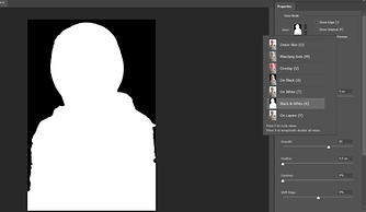
For the background, I want to change it with a new background with the same color as the previous background color which is grey. Quick Selection tool and Select Subject, again adjust the selection. Next I ,click on the select and mask and adjust the smoothness the of the selection and the radius. To see how smoothness the selection is, click on the View and select Black and White (below).
Next I want to change the background because the wall is quite dirty and has white spots on it. First, I click on the create new fill on the bottom part of the layer tool. Next, click on the circle that has a half on ii and select Solid Color and chose w same color as the wall which is grey. Then, I lick on the original picture and press Ctrl + j and this is going to copy the layer.

Next I click on the Output to and select layer mask then press okay.
After that click on the eye and enable or unhide the background color then done! Overall the image looks much better now to me as I can see half of the model’s face that was quite dark due to the shadow and the background also looks good and matches with the previous wall color. I had also fixed the exposure of the image and now the image has a better lighting.

I had also used some of the tools, that I found it to be very helpful in editing all of my pictures, tools such as Dodge tool, Blur tool, and the Spot Healing brush tool.

Dodge tool- it lightens an area of the image. This tool helps to lightens up my accessories and it makes the accessories stands out more.
Blur tool- it blurs an area of the image. I used this tool to blur up some things on my image, such as the clothes of the model which is not really important in this magazine and this helps the jewelry to stands out more.

Spot Healing Brush tool- it removes marks and blemishes. I used this tool to clear any dirty spots on my images because it is important for every images to be perfect and does not have any errors on it.

Here are the other pictures that I had edited quite similar just like the one that I used to edited on the first picture and these pictures are to be use for my magazine cover, double spread page and content page.
Cover Page


A B C
Double Spread Page


Content Page


The app that I used to add my masthead, taglines/ slogan, price line or selling line, cover strip, barcodes and main feature article to my magazine cover is by using an app called Adobe InDesign. Also to edit my double spread page layout and my content page.
This app enables us to adjust the font size and chose font type with different font color.
Same as the Adobe Photoshop app, I also had some difficulties on using Adobe InDesign but once I’d try the tutorial on the app and watch multiples of tutorial videos, I slowly manage to use the app and recognizes on how the app works.

Magazine Cover Page 1

As mentioned, I will be doing two magazine covers page and then I’ll choose which one to be my final magazine product. This is the first magazine cover that I will be editing in this app
Before I put all of my conventions on my magazine cover, first I choose the size of my magazine size which is an A4 paper size about (20×30). Then I drag the picture that I’ve chosen on the layout. The picture that I will be using is Picture B. Picture has a quite a harsh lighting on the model’s face and also the jewelries that the model is wearing does not stand out unlike Picture B the jewelries the model is wearing stand out more. Picture B has more space on top of the model’s head which I will be planning to put my masthead, tagline, price line as well as my date line on top of it.
For my masthead ‘JEWELS’ I want it to look elegant and bold at the same time, which I used the Bodoni MT (regular) and the reason why I chose this font is because I love how the ‘J’ and ‘W’, it had that elegant look that I want. The color that I used is a violet which is the color from the model’s blouse and I kind of like the color as it doesn’t really over powering with the main image with a white stroke on the font. The size of the masthead is important and it the size must be bigger than all of the strip and cover lines. The size for my masthead is 116 pt. The tagline ‘Exquisite. Elegance. You’ which is on top of the masthead as it is the first thing readers looks at. The type of font that I used for my tagline is also Bodoni MT (regular) with size of 21 pt and colored black and this is to match with the masthead as the color is quite dark. The same type of font I used for my date line and price line but with a smaller size which is 16 pt.
Masthead, Tagline, Price line and Date line

Cover Lines
For the next strip line of my cover, that I used is called Bodoni MT (Condensed Bold Italic) with a size of 24 pt for the’ Fit for Occasions’ and 27 pt for the ‘New Year’ and 38 pt for the ‘Glamour’ and with a different color, white for ‘ Fit for Occasions’ and Violet for ‘ New Year Glamour.

The next strip line is the same as the ‘Quick & Easy’ type of font but with a smaller size of 27 pt and with different font color. The extra information of the cover line which is on the bottom has also the same font type but not italic. There is also a picture of an earring with a page number on it which is the same font type but in a violet color and smaller size which is about 17 pt.


This is the main cover line or my featured article. The featured article is the one that must be stand out on the cover page so it is important for the size and type of font I’ll be using. The font I used for the main featured article is the same as my masthead, which is Bodoni MT (regular) with a size of 27 pt and font colored white because to match with the hijab and also because the background is already quite dark so the font needs to stand out which is why ii chose white.

Next cover lines is the ‘Quick & Easy’ and the font type is called Bodoni MT (Bold Italic) with a size of 53 pt and also with a different color of white and violet.

The last cover line is a bit different from other strip cover lines because I used a shape for the background which I used a rectangle shape on the tool bar with a white color and on it is the cover line which is I used different font, that is called Bodoni MT (Condens ed bold) . Below the cover line is the barcode which is on the right corner bottom part of the magazine
First Draft magazine cover

This is my final look for my first draft, the magazine somehow looks a bit messy for me and some of the fonts cannot be clearly seen on the model’s clothes , which is why I decided to try and edit another cover page which I’m going to use Picture C. The color scheme of the magazine to me is quite dark and doesn’t really stands out.
Magazine Cover Page 2
Same as the first magazine cover page, I start off by choosing the size of my magazine layout and then dragging the picture on the layout. The picture I’m using is Picture C which is the a picture of just the jewelry itself.

Masthead, Tagline, Price line and Date line

I changed my masthead font type which is called Cambria and I like how the ‘J ‘ is quite simple but then again elegant at the same time. The size of the masthead this time is slightly bigger which is 153 pt. The color of the font is gold which is the color scheme that I want and it quite matches with the warm tone of the main image cover. The date line which I put on top of the letter ‘E’ and matches the font color with the masthead but with a different font type which is Arial and with a size of 17 pt. Below the masthead is the tagline and price line that I used the same color which is emerald green and this is to match with the jewelry and the font type I used is Cambria (Bold) with a size of 16 pt.
Cover Lines
All of my cover lines/ strip lines has the same font type which is a font type called Cambria, but with a different character which is Cambria (Bold) and Cambria (Italic). The main featured article which is ‘What a pearl’ and the font sized used is slightly bigger from the rest of the strip cover lines. The color of the font is a two different color which is a Gold color for the main title and emerald green for the descriptions. At the bottom part of the magazine which is on the right corner is the barcode


I also add a FREE ticket which I used a shape as the background, with a gold color background which is to match with the strip lines and masthead. The font I used for this is called Arial with font size 27 pt and color white
Second Draft Magazine Cover

This is my f second draft magazine cover. Overall, I prefer this second draft magazine cover comparing it from my first magazine cover, most of my cover lines cannot be seen and some of it kind of blends it with the main image. Also the cover lines looks much more organized and the font’s style are consistent because to me, teenagers nowadays prefer a minimalistic and this could make them feel more mature. I’m also quite satisfied with the color scheme that matches with my main image which is the necklace.
Double Page Spread

After I have put all of the pictures on the first page of my double spread page. I went ahead and put the title of the page which I will be putting it below the pictures ‘Pearl Accessories’ I also put two line in between the title with a thickness of 3 pt and the purpose of this line is to make the headline of the page to be stands out more and readers know that it is the headline of the page and know what the article is about. The font type that I’m using is called Sheer Elegance with a size of 67 pt and the color matches with the color scheme of my magazine cover which is gold. Lasttly I put all of my featured article on my first page of my DSP. Same process for my second page of my DSP but it is an interview page with the model, then I put all of the pictures of the model


Final Production Double Page Spread

Content Page
For my content page, it is quite simple; first I use two shape rectangle with different color, one with gold which matches with the color scheme and one with a beige color for my background color of my content page


Next I just put all of my contents with number on the side of the contents. The font that I’m using for the contents is called Cambria (bold) and (regular). For the article I used font sized 15 pt and descriptions I used 12 pt. The font for the number is called Arial with size 18 pt. I also put the pictures that I edited and put it on the right hand side of the content page with each has their own page number
Final Production Content Page

This the final product of my content page and the color scheme matches with the color schemes of my magazine cover. Overall, it looks simple which is why I put many pictures on my content page and the style of font would attract my target audience too, as it matches with the theme. I also used a colored background, which are normally white but in my content page I used a beige colored.